Difference between revisions of "Pustaka Logo"
(Created page with "Pustaka Negeri Sarawak (Sarawak State Library), is conceived as a major information resource centre and as the hub of information services for the public and private sectors....") |
(No difference)
|
Latest revision as of 14:28, 9 August 2021
Pustaka Negeri Sarawak (Sarawak State Library), is conceived as a major information resource centre and as the hub of information services for the public and private sectors. It will link with libraries, archives and information centers elsewhere in Sarawak and throughout Malaysia. It will also provide a gateway into and from publicly accessible international information centres. Its complex will serve as a community centre of knowledge and cultural enlightenment, where Malaysians in Sarawak can not only access a vast store of information, in the form of both printed and electronic media, but also gather for educational and cultural exchanges, programmes and participate in many other regularly conducted activities.
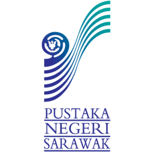
Logo Rationale

|
- Sarawak State Crest.
- The 5 curved lines are conceptualized from the side view.
- The following direction of these five lines from left bottom to right up corner is leading to * 5 Basic Qualities of a modern digital library.
- The shape of the traditional handicraft of hornbill ivory is conceptualized from a curved book cover, of which is to represent.
- The toning Pustaka Negeri Sarawak´s green is to represent boundless and infinite knowledge, just like sky and Ocean.